
Plot Homey Insights history over time.
On this page
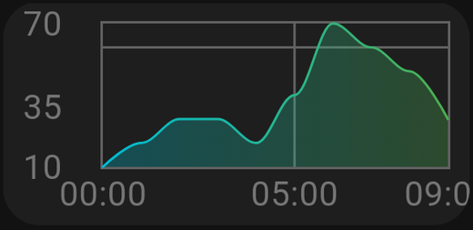
Plots Homey Insights — the history Homey keeps for your devices — as a line graph.
What you need first
Insights must be enabled for the capability in Homey. If a device does not appear in the list, Homey is not logging it: turn Insights on for that device in the Homey app, wait for some data to accumulate, then come back.
Settings
| Setting | What it does |
|---|---|
| Insights | Which insight(s) to plot. More than one can be added to the same graph |
| Resolution | The time window: last hour, last day, last week, and so on |
| Title | The card's heading |
| Y min | Fix the bottom of the vertical axis |
| Y max | Fix the top of the vertical axis |
Multiple insights on one graph
Add several and they are drawn together. This is where the card earns its place — indoor and outdoor temperature on one graph tells you something neither line tells you alone.
Only combine things with comparable scales. Temperature and power consumption on the same axis makes one of them a flat line.
Y min and Y max
Leave both empty and the graph scales itself to the data. That maximises detail but means the axis shifts as values change, which can make a stable value look dramatic.
Set them for a fixed axis. For indoor temperature, 15 to 25 keeps normal variation looking normal.
Resolution
Shorter windows show detail; longer windows show trends. Note that a long window over a busy sensor is more data for your Homey to send — if a graph is slow to appear, a shorter resolution is the first thing to try.
Tips
- Give it width. Graphs need horizontal space. A full-width card is usually right; a small square graph is unreadable.
- Pair it with a gauge. A Gauge for now, a graph for the trend.
- Energy. Plotting
measure_powerover the last day is one of the most useful cards you can make — it shows exactly when the house draws its electricity.