
Colours, font size and layout options that change how a card looks.
On this page
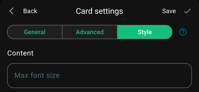
The Style tab controls how a card looks. It is the same on every card type, and it is what turns a functional dashboard into one you enjoy looking at.
Background colour
The card's own colour, replacing the theme default.
Colour is the fastest way to make a dashboard readable at a glance. A common scheme:
- One colour per room, so a mixed dashboard groups visually.
- Or one colour per function — lights warm, climate blue, security red.
Cards can also be semi-transparent, which matters when the dashboard has a background image: lowering opacity lets the wallpaper show through and stops the grid looking like a wall of boxes.
Foreground colour
The text and icon colour. Set this whenever you set a background colour — dark text on a dark card is the most common way a dashboard becomes unreadable.
The rule is contrast: light text on dark cards, dark text on light ones.
Content
Which part of the card the style applies to, where a card has more than one region.
Max font size
Caps how large the card's main text will grow.
Cards scale their text to fit, which means the same value can appear at different sizes on differently sized cards. Setting the same Max font size across a row of cards makes them look deliberate rather than accidental — this single setting does more for a tidy-looking dashboard than any other.
It is a maximum, not a fixed size: text still shrinks to fit a small card.
Flip X
Mirrors the card horizontally.
Mostly useful for cards with a directional layout — an icon on the left that you would rather have on the right, so that a pair of cards mirror each other.
Live colours from a flow
Card colours do not have to be static. With the companion app, a Homey flow can change a card's background colour while the app is running — turning a card red when a door is open, or amber when the washing machine finishes.
The colour set here is the starting point; the flow overrides it.
Tips
- Restraint reads better. Three or four colours used consistently looks designed. Twelve looks like a test page.
- Check it in both themes. HDashboards has light and dark themes, and a colour chosen in one can be unreadable in the other. Switch theme in Settings and look again.
- Test at a distance. For a wall panel, stand where you will actually be standing. Contrast that looks fine at arm's length often does not survive across a room.